Developing New Deposit Feature
DaySmart Software / 2023
Overview
No-shows have long been a major challenge for salon and pet grooming business owners, leading to wasted time and lost revenue. While DaySmart offers advanced booking and payment features, there was no existing solution to mitigate this issue. Recognizing this gap, the product team decided to develop a new feature to address the problem. The goal of this project is to empower users to set up, collect, and refund deposits, as well as provide deposit reporting.
Role
As the Lead UX Designer on this project, I was responsible for both research and design. I led brainstorming sessions and design reviews with fellow UX designers, and worked closely with the product manager to iterate on the design and strategically plan the deployment phases.
User Research
With a clear focus, we began by conducting user interviews with six participants. We then synthesized the feedback using affinity diagramming to identify key themes. The goals of our user research were to:
-
Understand the current deposit process, including user needs and pain points.
-
Explore the ideal deposit process, uncovering user preferences and desired experiences.
User Interviews
We gathered feedback from six of our salon and pet grooming customers to understand how they collect deposits and uncover their ideal workflows—gaining valuable insights in the process.

"I actually think (whether to take) deposit should be overseen by a real brain. Like, we wouldn’t want to ask a long-time customer for one—it kinda feels like we don’t trust her."

"I wish we can have a step-by-step guide to collect the deposit (on the online booking website), because people don’t like to read"

"There needs to be a feature in the app. In the field, the groomers use the app only"

"We take deposit if canceling with 24-h mark; charge 50% of service as if no show."
Affinity Diagramming
We turned all the feedback into sticky notes and organized them into an affinity diagram. From there, we identified several key themes.
Fig: Affinity diagram
Insights
Based on user interviews, we gained a clear understanding of the ideal deposit collection process. Through our affinity diagramming, we uncovered key themes and user needs that should be addressed in the product design.
Key insights include:
-
Varied deposit workflows: Pet grooming and salon businesses collect deposits differently. Grooming businesses tend to collect deposits by customer, while salons often do so by service or ticket.
-
Need for flexibility: Front desk staff need the ability to decide whether to collect or waive a deposit—especially for loyal or returning clients.
-
Accurate calculation and tracking: The system should notify staff when a deposit has been collected for a ticket, automatically deduct it from the total, and prompt the customer to pay only the remaining balance.
-
Customizable refund rules: Businesses follow different policies for handling deposits and no-shows. The system must be flexible enough to accommodate a variety of rules.
-
End-customer transparency: To avoid confusion, deposits should be clearly listed on the customer’s receipt.
Conceptualization
After capturing the user feedback, I created a journey map that illustrated the ideal workflow between the user and the system, while addressing the key insights gathered. The journey map also served as a deliverable to effectively communicate with the product manager and stakeholders.
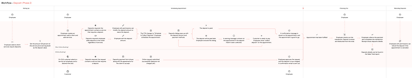
Fig: Journey map
Solutions
With the stages of the process identified in the journey map, we carefully integrated new sections into the existing UI, aiming to minimize disruption to the current user experience. Here are the key design points at each stage:
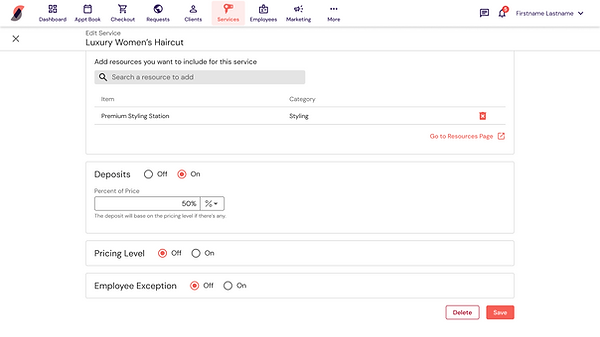
Stage 1 - Setting up a Deposit
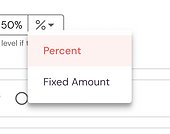
Since some businesses collect deposits by service, we added a new section to the services page to set deposit amounts. In response to user feedback for flexibility, we supported both fixed amounts and percentage-based deposits to accommodate a range of needs.
Stage 2 - Collecting a Deposit When Booking an Appointment
When a service with a deposit is selected, the deposit automatically appears on the appointment. Front desk staff can toggle the deposit off if needed. Additionally, if no service with a deposit is selected but the business wants to collect a deposit for a specific customer, users have the option to apply a deposit to the ticket manually.

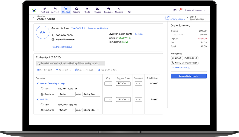
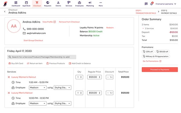
Stage 3 - Checkout
During checkout, it is crucial to calculate the deposit accurately and deduct it from the total. For transparency, the deposit should also appear on the transaction summary and the receipt.
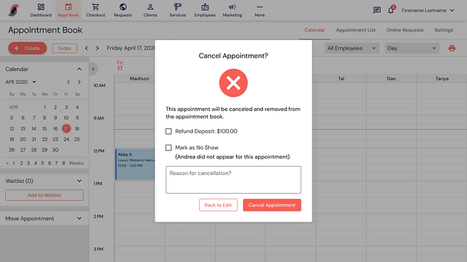
Refunding a Deposit
When an appointment is canceled, businesses should have the option to refund the deposit or not. For instance, if the cancellation is due to the business's unavailability, a refund might be necessary. From the user interviews, we learned that some businesses have deposit refund timeframes, and we plan to address this in a future iteration.
Evaluation and Impact
We conducted evaluations both before and after the product release. Before handing the design to the engineering team, we ran a 2-week usability test using Useberry. The test included 3 tasks, each followed by related questions, and we gathered feedback from 7 users. The results revealed that 70% of users successfully completed the tasks, though some misclicks were observed. We also received valuable feedback, including requests for more advanced deposit automation and the ability to send deposit inquiries to customers booking online.
After the feature was developed, we tracked product metrics like 30-day new user engagement and satisfaction ratings to assess its success. In the first 2 weeks, we saw over 100 new users, with that number rising to over 150 in the first month. The total amount deposited reached around $23,000, confirming the design's success.
150+
New users
in first 30 days
$23K
Amount deposited
in first 30 days
"This feature is pretty simple. I also see where you can override the deposit which is good as well."
"I like this feature because you can add a deposit even if it didn't require it. This is what I was wanting because I don't want to require a deposit on loyal clients."
Project Learnings
We were tasked with building a specific feature to help users avoid no-shows - a deposit system. While we fully understood the user pain points and project goals, we still conducted user interviews to uncover the specific challenges they faced and the workarounds they had been using. I’m proud to say that this project was not only built and released, but also iterated in two rounds to refine and improve the user experience. Here are my top 3 learnings:
-
Connecting with Real Users is Key 👱🏼♀️
This project took place at a time when user interviews weren’t a major focus for the company. The UX team saw this as a valuable opportunity to demonstrate the importance of user research. Given the widespread no-show issue, we knew connecting directly with users would provide crucial insights.
-
Implementation in Phases 🗂️
As a designer, I’d ideally want the full design to be implemented from the start to ensure a seamless user experience. However, we have to balance that with budget and resource constraints. Implementing the feature in phases isn't necessarily a negative approach—provided we commit to returning for the next phase of development.
-
Assessing via Product Metrics 📊
This project was one of the first where we implemented product metrics and satisfaction ratings post-release. These metrics were invaluable in understanding the feature’s impact and reinforcing our commitment to continuous discovery and improvement.