Designing Multi-View Calendar Experience
DaySmart Software / 2020

Overview
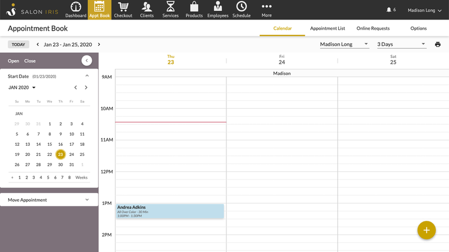
Users manage the calendar in different ways. Front desk staff prefer the month-view for its convenience in checking overall availability, while service providers lean towards the day-view to see their daily schedule. We were tasked with reimagining the appointment calendar by offering multiple day views, along with the ability to view multiple employees, to meet varying user needs across different scenarios on desktop and app.
Role
As the main UX Designer on this project, I was responsible for driving the design process from start to finish. I led brainstorming sessions with fellow UX designers, held design reviews with the UX manager, and worked closely with the product manager to ensure the solution aligned with overall product goals.
Research
For this project, we primarily used comparative analysis. The research aimed to understand:
-
How modern calendars function and appear
-
What additional features competitors offer
Comparative Analysis
To start, we compiled a list of competitors, as well as software and apps that offer calendar features. We then categorized these competitors into tiers:
-
Tier 1: Direct competitors, including salon softwares such as Vagaro, Fresha, and MangoMint.
-
Tier 2: Indirect competitors, including online scheduling softwares like Square and Mindbody.
-
Niche: Niche competitors, including general calendar software such as Google Calendar.
TIER 1


TIER 2


NICHE

Comparative Analysis vs. Competitive Analysis?
While both comparative and competitive analysis involve comparison, comparative analysis focuses on identifying similarities and differences between entities or options, while competitive analysis specifically examines the strengths and weaknesses of competitors to understand their market position and strategies.
Insights
After analyzing the competitors, we discovered that calendar layouts can vary significantly. For example:
-
Group by employee: This layout centers around the employee, displaying their schedule in a day, 3-day, or week view. It’s ideal for users who want to focus on individual employee availability and workload.
-
Group by date: This layout is organized by date, showing all selected employees’ schedules for a specific day, 3-day range, or full week. It works well for front desk staff who need to quickly pinpoint availability on a given date.

Group by Employee
.png)
Group by Date
After discussions with the product manager, we decided to move forward with the "group by date" approach. Since the desktop site is primarily used by front desk staff, this layout better supports their workflow and helps them complete tasks more efficiently. To meet the needs of individual service providers, we also introduced multiple day views in the mobile app—where usage is higher among providers working at their stations.
Additionally, we included both month view and list view options to support a wider range of use cases and preferences.
Solutions
Multi-Day View
To support different scheduling needs, we designed day, 3-day, week, and month views, all accessible through an intuitive dropdown menu for easy switching between modes.
Multi-Employee View
Alongside the different day views, we also designed how multiple employees are displayed in a clear, easy-to-scan interface. To accommodate the space needed, we implemented horizontal scrolling. We also introduced a thoughtful employee filter, allowing users to quickly select one or multiple employees—and even filter to show only those who are scheduled to work.

Designed for On-the-Go Users
The app isn't just for individual service providers—it also supports business owners and employees who are on the go. We created an intuitive layout with a prominent date toggle at the top, making it easy to switch between dates. Employee filters for each view mode were thoughtfully designed to ensure a smooth user experience across different roles and scenarios.

OLD

NEW
Project Learnings
While conducting the comparative analysis for this project, I learned a lesson from one of my favorite managers and mentors that has stuck with me ever since. Although competitive analysis is a valuable research method, it has its limits—we can’t truly know how effective a design is without access to competitors’ usage data. In the end, nothing replaces the value of talking directly to users. Direct user insights will always be more powerful than assumptions based on what others are doing.


